BARRONVISUAL
Blog·Shopping Experience

The 5 Unwritten Rules of the Tactical Transition: From the Street to the Till.

Juan Carlos Barrón·September 2026·Shopping Experience
nueva tienda zara entrada maniquies

If Window Display got you the match, Visual Merchandising has to close the deal. The key is impact coherence. The emotion created outside must be validated and monetized inside.


1. The ‘Cushioned Impact’ Rule: The Decompression Zone


The Tactic: Never let the customer bump straight into the product the moment they walk in.

  • The Fatal Error: Placing your most eye-catching product or an offer right at the door. The customer, coming from the frantic pace of the street, needs a few seconds to reset and take in the interior. If the product is too close, they’ll ignore it or walk past without really seeing it.
  • The Underground Solution: The Decompression Zone. Leave a clear space of 3 to 5 meters right after the threshold. Only brand elements belong here (a conceptual mannequin, an art piece, a sign with the manifesto). It’s a buffer that tells the customer’s brain: «Slow down, you’re entering another world.»

New Zara store entrance with mannequins forming a brand-focused decompression zone


2. The Visual ‘Plot Twist’ Rule: The 3-Meter Metric


The Tactic: The concept that attracted the customer outside must be replicated at a small scale, immediately accessible.

  • The Fatal Error: Letting the window display’s concept die at the glass. The customer walks in looking for validation of the emotion they felt. If they don’t find it, they get frustrated.
  • The Underground Solution: Within 3 meters of the Decompression Zone, the ‘MVP’ (Most Valuable Product) should appear, or a display that replicates the window’s theme with the product at interaction level. If the window showed a distressed leather jacket, the interior display needs that same jacket, hung in a distinctive way and ready to be touched. Aesthetic coherence builds the confidence to buy.
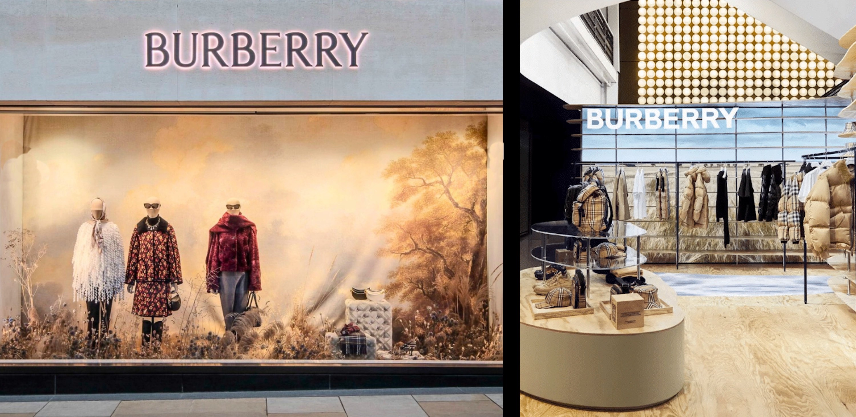
Burberry window display next to its matching in-store product display


Shall we apply it to your store?Talk to Juan Carlos for 20 minutes, no commitment

3. The ‘Back to the Door’ Rule: The Forced Route


The Tactic: Design the layout so the customer can’t avoid seeing 80% of your merchandise.

  • The Fatal Error: Placing fitting rooms, high-necessity products, or the register near the entrance. This lets the customer walk in, go straight to what they need, and leave.
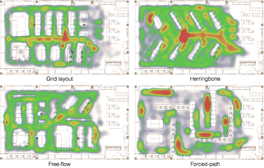
  • The Underground Solution: Force them right. The average customer in the West instinctively tends to turn right when entering. Design your route counter-clockwise. Place your «hot spots» (high-turnover products and fitting rooms) at the back and to the left. The customer is forced to walk through the entire store, exposing them to 90% of your visual traps and impulse buys.
Diagram comparing different retail store layout patterns
Different store layout patterns


4. The ‘Spotlight’ Rule: Differential Lighting


The Tactic: Use light as a funnel that guides, not just a bulb that illuminates.

  • The Fatal Error: Using flat, uniform lighting across the whole store. This erases hierarchy and makes every product look equally important (or equally boring).
  • The Underground Solution: Luxury contrast.
    • Use accent lighting (focused, dramatic) to highlight only your key products (high margin or new arrivals).
    • Keep ambient light (soft, warm) in the rest of the aisles.
    • The customer’s eye is drawn, like an insect, to points of intense light, making sure your strategic products dominate their attention.

Abercrombie store interior showing dramatic accent lighting against ambient darkness


5. The ‘Zero Noise’ Rule: Removing the Obstacle


The Tactic: If the window display is loud (emotional), the in-store VM has to be quiet (functional).

  • The Fatal Error: Visual noise. Overcrowded displays, old promotional signage, clutter, or products grouped only by category. This confuses and creates anxiety.
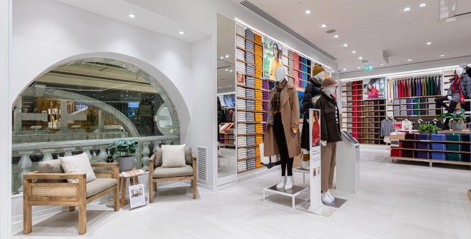
  • The Underground Solution: Clean lines. Make sure cross-merchandising (complementary products) is clean and logical. Aesthetic chaos outside is artistic license; chaos inside is an obstacle to the sale. The customer is already convinced, don’t distract them with irrelevant information.

Uniqlo Madrid store interior with clean, uncluttered product displays

Applying these tactics turns the window display’s ephemeral art into a well-designed trail of breadcrumbs that inevitably leads to the register.

We ❤️ Visual Merchandising

Studio

Does your window display need this same criteria?

We handle your window display's full design, fixed price, no quotes needed beforehand.

See Window Display DesignOr talk to Juan Carlos for 20 min
5 Rules of the Transition: Street to Till | BARRONVISUAL