What a Phygital Visual Merchandiser Is (and Why UX, SEO or CRO Alone Are No Longer Enough)
Juan Carlos Barrón·September 2026·Phygital Merchandising
Visual Merchandising no longer ends at the window display. It starts before that: in a search result, in a TikTok video, in a generative AI’s answer. And it ends later: the moment the order arrives home and the customer decides whether to come back.
For decades, the Visual Merchandiser’s craft played out inside a physical space: window, product placement, layout, lighting. eCommerce, meanwhile, developed on its own, with its own specialists: UX, UI, CRO, SEO. Each discipline solved its own piece very well. But nobody stayed focused on the whole.
That’s exactly the gap the Phygital Visual Merchandiser fills.
What a Phygital Visual Merchandiser is
A Phygital Visual Merchandiser is the professional who designs a brand’s entire commercial experience without distinguishing between the physical store and the digital channel, because the customer doesn’t distinguish either.
They’re not a UX designer with some window-display knowledge, nor a window dresser who’s learned Figma. They’re someone who understands that a window display, a homepage hero, a product page and a till counter all solve exactly the same problem (catching attention, holding it, and turning it into a decision) with different tools.
Put another way: the traditional Visual Merchandiser designs commercial spaces. The Phygital Visual Merchandiser designs commercial ecosystems. The difference sounds small, but it completely changes how retail is understood.
At BARRONVISUAL this idea sits at the centre of BARRONSYSTEM, the methodology that connects window, store, website, eCommerce, brand perception and KPIs within a single visual-direction structure. The Phygital Visual Merchandiser is, simply, whoever operates it.
From the window to the algorithm
A customer might discover a brand on Instagram, search for it on Google, compare prices on their phone, walk into the physical store to see it in person, and buy it days later from the sofa. Or they might do it the other way round: get to know it in front of a window display, scan a QR code, check reviews on their phone and end up buying on the website because the store didn’t have their size.
For that customer there’s no online world and a separate offline world. There’s a single experience, with several entry points. One of the most common retail mistakes is managing channels as if they were separate businesses: one team for the physical store, another for eCommerce, another for digital marketing, another for social media, each with its own objectives, its own metrics, and sometimes even a different visual identity. The customer never perceives that separation, because to them the brand is one thing. The journey has stopped being linear: it’s dynamic, it changes by the day, and it’s fully omnichannel.
Classic Visual Merchandising was designed for a world with a single entry point: the store door. That world no longer exists, and the tools that served for decades (window display, lighting, planogram) remain valid, but they’re no longer enough on their own.
When someone walks into a store, they don’t ask themselves who designed the layout, who chose the lighting, or who decided where the fitting room goes. They only sense whether buying there feels easy or awkward.
The same happens in an online store. The user doesn’t distinguish between UX, UI, SEO, CRO or development. They don’t know who organised the category menu or who optimised the load time. They either find what they’re looking for quickly and enjoy the process, or they leave the page within seconds.
That’s why it’s so easy for an online store to be flawless in development and still sell poorly: chances are nobody thought of it as a selling space, only as a software product. That’s exactly where a Phygital Visual Merchandiser is missing.
The hero is the new window display
For more than a century, the window display has been Visual Merchandising’s most powerful tool: the first contact between a brand and its customers, the place where curiosity was sparked and the buying process began. A good window didn’t just show product, it invited people in. A window has between three and five seconds to stop someone on the street. A homepage hero has, roughly, those same three seconds before the user decides whether to keep looking or close the tab.
The customer no longer stops in front of glass, but in front of a screen: scrolling through Google results, Instagram posts, TikTok videos or an AI’s recommendations, and when they land on a website they decide within seconds whether to keep exploring or leave. A window dresser knows that an overloaded window doesn’t sell more, it sells less, because the eye finds nowhere to rest. It’s what behavioural psychology calls Hick’s Law: the more options presented at once, the longer someone takes to decide, and the more likely they are to decide nothing at all. That same rule, visual hierarchy, a single protagonist, breathing room around it, is what decides whether a hero converts or the user scrolls past without noticing anything. Catch attention. Build interest. Invite them onward: the principle stays the same, it just happens on a screen now.
The same language, two window displays
The parallel doesn’t stop at the hero. A store’s full journey doesn’t disappear on the web either: it becomes the conversion funnel. Every screen replaces a commercial space, every click replaces a step, and every decision moves the customer closer to or further from the purchase. Almost everything a Visual Merchandiser already knows how to do in store has an exact equivalent on the web, just under a different name.
Layout still exists, even without walls
The main menu acts as signage: it orients the visitor just like the signs in a big-box store. Categories are the departments. Filters are the zoning that helps find a specific section without getting lost. Featured products occupy the place of tables in a store’s hot zones. And the footer is the last stretch of the store, the one walked just before heading out the door, where trust can still be reinforced or a last doubt resolved.
Physical store
Digital channel
Window display
Homepage hero
Signage
Main menu
Departments
Categories
Zoning
Filters
Hot-zone tables
Featured products
Shelf / planogram
Category page
Fitting room
Product page
Till
Checkout
Last stretch before leaving
Footer
The shelf is now called the category page
Just like on a shelf, the product placed first, given the most space and best lit (photographed) is the one that sells the most. A category page’s order is a planogram under another name, and follows the same visual hierarchy rules.
The fitting room is the product page
In store, the fitting room is where the customer really decides. On the web, that decision happens on the product page: the photos act as a mirror, the description acts as a shop assistant, and the reviews act as the friend who tells you «that looks good on you». If the fitting room is badly lit, it doesn’t sell. If the product page has dark or badly cropped photos, neither does it.
The till is the checkout
Any Visual Merchandiser knows the till queue is the worst moment to make things harder for the customer: it’s when they’re most likely to change their mind and leave. A checkout with too many steps, unnecessary forms or last-minute price surprises is exactly that same mistake, moved onto the screen. Behavioural psychology has a name for this: the peak-end rule, which explains why an experience’s final stretch weighs more in memory than almost everything before it. A bad checkout can ruin a visit that had been perfect up to that point.
A Phygital Visual Merchandiser’s KPIs
In a physical store, a Visual Merchandiser already measures foot traffic, entry rate, try-on rate and average ticket. The Phygital Visual Merchandiser adds the digital indicators to that list, because they describe exactly the same thing under a different name:
CTR: the equivalent of how many people stop in front of the window.
Bounce rate: how many people come in and leave without looking at anything, like someone who walked in by mistake.
Average dwell time: how long someone stays looking, just like in store.
Scroll and heatmaps: the real path taken across the page, just like a hot-spot map in store.
Add to cart (ATC): the equivalent of picking up the garment and taking it to the fitting room.
Conversion: the closed sale, whether it happens at the till or at the pay button.
Average order value (AOV) and purchase frequency: the equivalent of the average ticket and of whether the customer comes back.
ROAS and LTV: how much each euro invested in attracting someone returns, and what that customer is worth over time, not just on the first visit.
These indicators answer very specific questions: does the homepage hero really work? does the new photography convey the product better? does that banner generate sales or just take up space? Those questions used to depend on the opinion of whoever carried the most weight in the room. Now they depend on evidence.
No window dresser should keep designing «because it looks nice» when there’s already a way to measure whether it works. Aesthetics without data is opinion. With data, it’s judgment.
The profiles a Phygital Visual Merchandiser must understand, and why none of them has the full picture
A Phygital Visual Merchandiser doesn’t replace these specialists. They need to understand enough of each to direct the whole, and to know exactly where each discipline’s view ends.
UX makes sure navigation works. It doesn’t decide whether the product generates desire.
UI makes sure the interface is coherent. It doesn’t decide which product deserves the hero’s spotlight.
CRO finds where conversion is lost. It doesn’t decide why that page fails to move anyone.
SEO makes sure you’re found. It doesn’t decide what you’ll show people once they arrive.
Information architecture makes sure categories are logical. It doesn’t decide which product goes first within each one.
Development makes sure the website works and loads fast. It doesn’t decide whether what loads actually sells.
Product photography handles image quality. It doesn’t decide in what order or hierarchy it’s used.
Copywriting handles the words. It doesn’t decide what the eye looks at first, before reading them.
Each discipline handles its own piece very well. By design, nobody is responsible for asking a more important question: are we building a commercial experience coherent with the brand’s identity and with how our customers actually buy? That question is exactly the one the Visual Merchandiser has always answered inside the physical store: they didn’t just design window displays, they designed a complete shopping experience. The digital environment needs exactly the same thing.
The Phygital Visual Merchandiser’s skill set
It’s still essential to master window display, composition, colour theory, lighting, product placement and consumer psychology: that hasn’t changed. To those skills, you now have to add others that until recently belonged only to the digital world: understanding basic UX principles, knowing how to read a heatmap, collaborating easily with a CRO specialist, taking part in an online store’s architecture, understanding SEO and GEO, analysing KPIs, knowing how an eCommerce platform works, and using AI tools well.
It isn’t about replacing these specialists. It’s about speaking their language: the more coordination there is across disciplines, the more coherent the experience the customer receives.
The conductor, not the instrumentalist
A Phygital Visual Merchandiser doesn’t replace any of these profiles. They coordinate them from a commercial perspective, connecting brand strategy with customer behaviour so that every touchpoint (from the first ad to the order-confirmation screen) works in the same direction. They don’t need to play every instrument better than the specialist who plays it. They need to know what should be heard, at what moment and with what intention, and have the judgment to ask each discipline to follow that shared score. Because selling isn’t just about attracting visits: it’s about building a journey capable of turning attention into trust, and trust into a purchase. That role, coordinating perception, experience and performance as a single system, is exactly what we call BARRONSYSTEM at BARRONVISUAL.
The window display starts on Google (and on TikTok, and in an AI)
Before anyone sees your window display, they’ve probably already seen you somewhere else: in a Google Images photo, a saved Pin, an Instagram reel, a TikTok video. Each of those formats is, to all effects, a miniature window display, and should be designed as such: with hierarchy, a clear protagonist, the same visual discipline as a shop window.
GEO: when it’s no longer Google recommending your store
More and more searches don’t end in a list of results, but in a generative AI’s answer. Optimising for that is called GEO (Generative Engine Optimization), and it means your brand, your terminology and your judgment get cited when someone asks an AI where to buy something or how to do something. It’s literally BARRONSYSTEM’s eighth layer: the AI Visibility Layer.
Artificial intelligence can massively speed up this work: generating variations of a window display before building it, comparing concepts, drafting copy, analysing heatmaps or spotting opportunities within a conversion funnel. It can propose a hundred different solutions. What it can’t do is decide which of them truly serves the brand’s objectives, or replace the judgment of someone who understands how desire is built. AI doesn’t replace the Visual Merchandiser: it multiplies their capacity, and it probably widens the gap between those with judgment and those who only execute repetitive tasks.
Phygital retail in practice
No need to invent examples: there are already brands operating this way, observable by anyone who visits them both in store and on their website. Zara syncs its signature photography campaigns with the styling of its seasonal windows. Apple designs its stores and its website with the same grammar of white space, single product hierarchy and total absence of visual noise. Nike connects its flagships with personalisation apps that later translate into physical displays. Hermès, Louis Vuitton and Loewe carry the same language of craftsmanship and scale over to their online product pages. COS keeps an identical palette and photography in store and on eCommerce, with no visible seam between channels. Amazon turns every product page into a real-time personalised window display, with recommendations that work like a shop assistant who already knows what you usually buy. And IKEA carries the same forced route that runs through its entire physical store over to an augmented-reality app, where you can see the furniture in your own living room before deciding.
None of them call it «Phygital Visual Merchandising». But it’s exactly what they’re doing.
How BARRONVISUAL works
I’ve been in this craft for 28 years: as a window dresser and visual merchandiser at Zara France (Inditex), CHANEL, Galeries Lafayette and Lladó, directing international rollouts, and in recent years designing online stores, digital experiences and applying artificial intelligence to creative and commercial processes. That path has led me to a simple conclusion: no store or brand needs only a window designer, or only a UX expert, or only an SEO specialist. It needs someone able to understand how all those disciplines relate to each other and turn them into a single commercial strategy.
At BARRONVISUAL we don’t sell pretty windows or pretty websites separately. We operate BARRONSYSTEM as a single system of perception, experience and performance, and we offer three ways in depending on what your store or your brand needs: Studio if you need execution (window, interior VM, website or eCommerce), Academy if you want to learn to operate it yourself, and Consulting if you need someone to lead that transformation from start to finish.
In summary
Visual Merchandising hasn’t disappeared with the arrival of digital commerce. It has become more necessary than ever, because the shopping experience no longer happens only inside a store: it starts when someone discovers the brand on a search engine, continues as they browse the website, gets reinforced on social media, gets confirmed in the physical store, and ends (or starts again) when that customer decides to come back because the experience exceeded what they expected.
Neither window display alone, nor a good website alone, nor a conversion funnel optimised in isolation is enough anymore. In the end, whether in a luxury boutique or an online store, nobody buys a window, a page or a button: they buy the trust a brand manages to convey at every one of its touchpoints. Whoever can direct that coherence, not just design each separate piece, is the Phygital Visual Merchandiser. And that’s exactly the discipline we define and operate at BARRONVISUAL.
Free resource
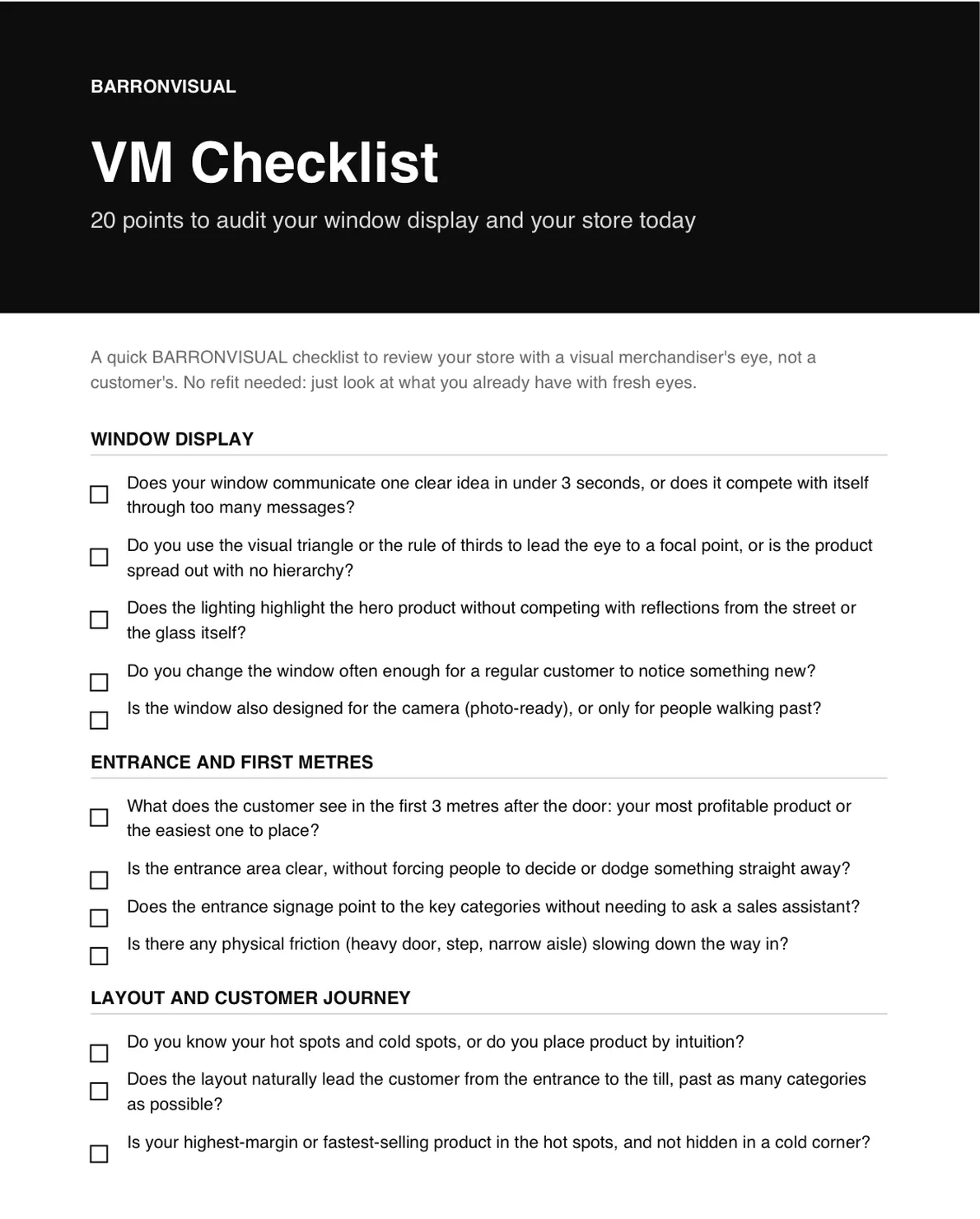
VM Checklist: 20 points to audit your storefront and your store today.
A short PDF to review your store with a visual merchandiser's eye, not a customer's. No renovation needed, just look at what you already have with fresh eyes.
I send you the PDF and, over the following days, 4 short emails to apply it. Unsubscribe in one click.