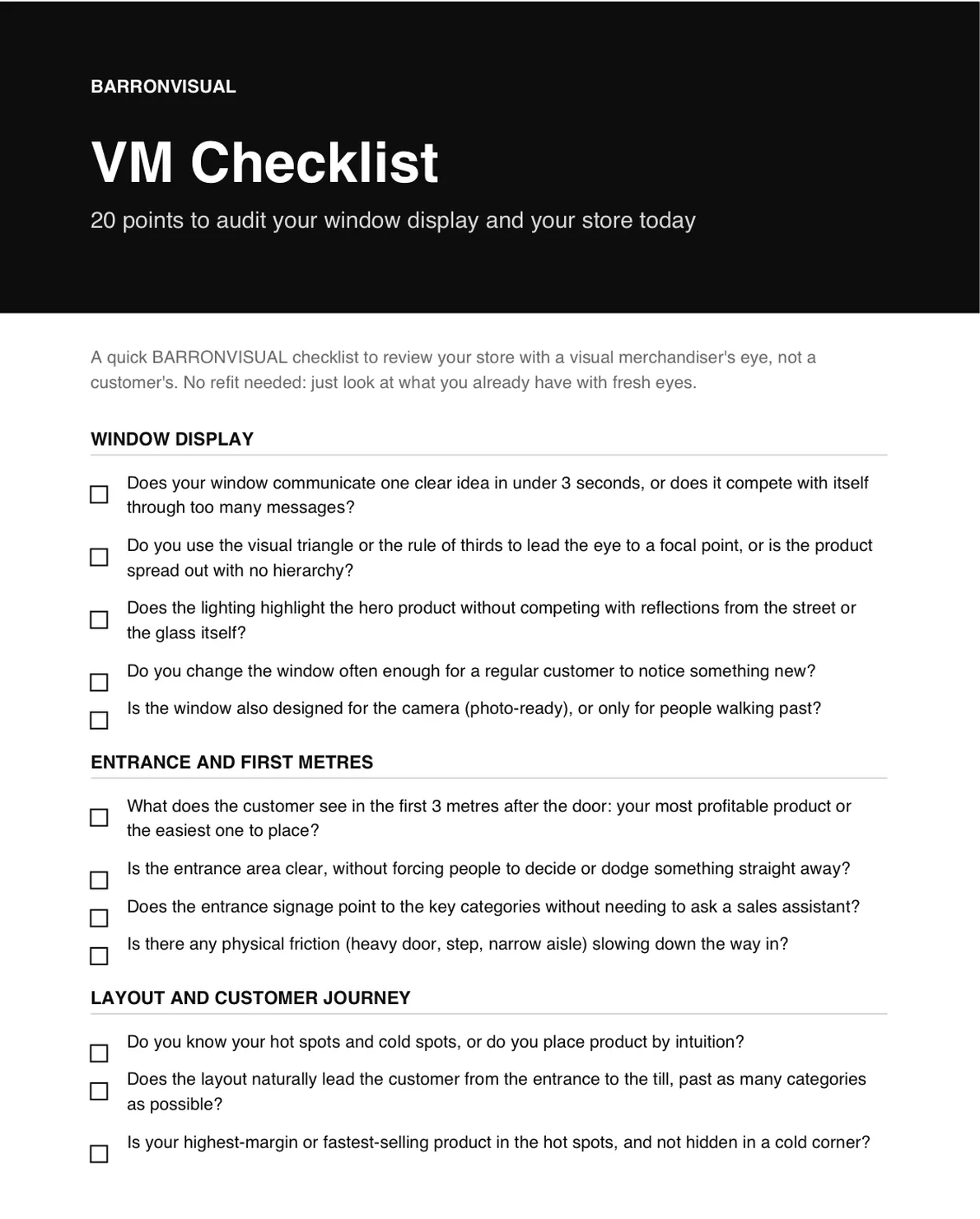
Almost no shop in Zamora has a product problem. It has a window problem, and increasingly, a website problem. I’ve spent 28 years designing the first one (Zara for Inditex, CHANEL, Galeries Lafayette, Lladró), and from my studio in Zamora I apply the exact same criteria to the second: an online store isn’t a formality you check off, it’s a window that works 24 hours a day, and most local shops either don’t have one, or have one that sells nothing.
The underlying data confirms it. According to the latest published edition of Red.es’s (ONTSI) Comercio Electrónico en España report, around 30% of Spanish businesses sold online in 2022. Put the other way: the majority, two out of three, still didn’t. In a province with a mostly small, neighborhood-scale retail fabric like Zamora, that proportion is almost certainly even lower.
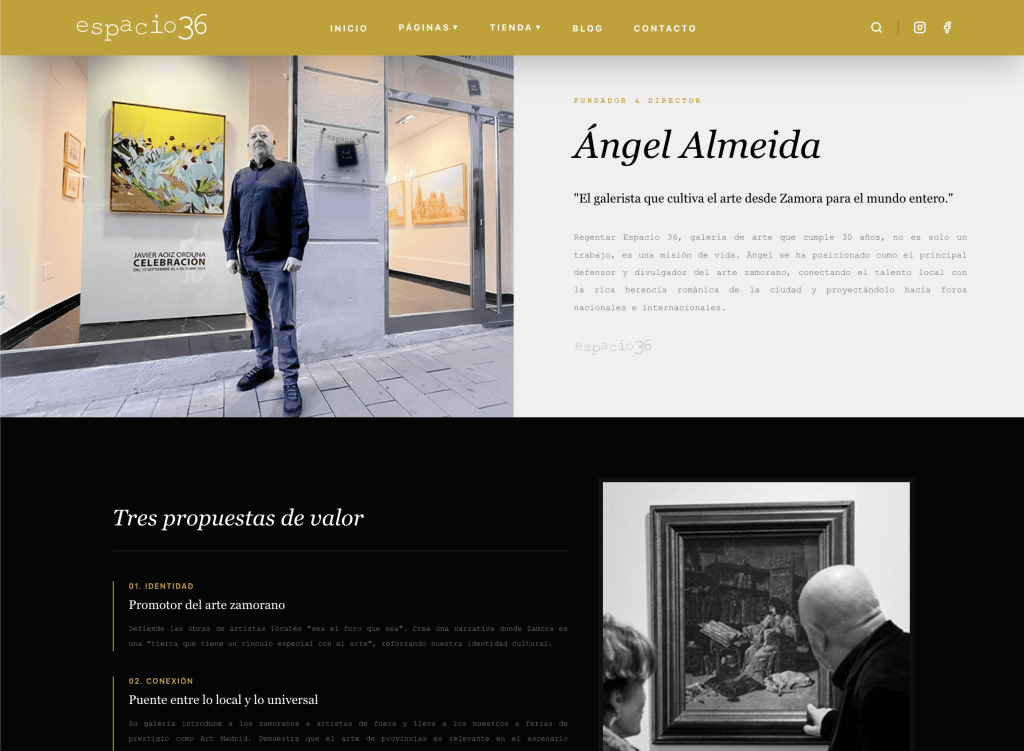
See the website of Angel Almeida’s Espacio 36 art gallery.
Why «we already have a website» isn’t the same as having a website that sells
There’s a real difference between a website that exists and a website that converts, and almost no shop knows it until someone explains it. A generic template, with photos the vendor supplied or ones taken on a phone on a Sunday afternoon, with no clear hierarchy between what you want to sell and everything else, is the exact digital equivalent of the cluttered, unfocused window we already discussed in our post on local retail. The difference is that on the street, a pedestrian takes three seconds to decide whether to go in. On a website, it takes less.
A now-classic usability study (Lindgaard, Fernandes, Dudek and Brown, 2006, «Attention web designers: You have 50 milliseconds to make a good first impression!») showed that users form a first opinion of a web page in as little as 50 milliseconds, before they’ve even read a single word. That opinion then shapes all subsequent judgement about the brand. There’s no room for a website that’s «already done, even if it’s not great»: in practice, that room lasts less than a blink.

What a Zamora shop’s website actually needs
You don’t need an eCommerce project on the scale of a multinational. You need judgement applied to what the shop already has, exactly the same principle we defend for the physical window:
Designed for mobile first, not desktop. Most of a local shop’s traffic arrives from a phone, not a desktop computer. A website that looks good on a big screen but is awkward on mobile is losing most of its visits before anyone decides anything.
Real product photography, not stock. Same as with a mannequin: a garment or product photographed badly, with flat light and a cluttered background, sends exactly the opposite message from the one you want. Product photography is the window inside the window.
Navigation that reflects how the physical store is actually organized, not a random list of categories. The same layout and hot-spot criteria applied inside a store carries over to the menu and homepage: what sells most, most visible; what’s in season, first.
A checkout process with no real friction. Every extra step between «I want this» and «I’ve bought it» is a lost sale. In-store pickup, clear payment methods from the start, no unnecessary mandatory sign-ups.
Coherence with the physical store. Same colors, same typography, same tone. A customer who visits the website after seeing the window has to recognize the same brand, not a different, improvised version.

See the online store of Diva Zamora, in the San Andrés neighborhood.