

Retail has confused emotion with overdose. And maybe the customer no longer needs another spectacle: they need something that makes sense.
By Juan Carlos Barron
Dior turns a facade into a monumental cake: fantasy, desire, excess and visual marketing in pure form.

For years we were told the physical store was dead. That the future was digital, fast, measurable, clean, automated and tremendously efficient. The store seemed too expensive, too slow, too dependent on the body, on walking, on the weather, on a person’s real desire to leave home and step into a space.
But physical retail didn’t die. It did something far more interesting: it became spectacle.
And now here we are, looking at facades turned into giant cakes, bags the size of buildings, octopuses invading stores, inflatable pop-ups, monumental installations, airports turned into surreal scenes, and window displays that no longer settle for being behind a pane of glass.
Dior turns a boutique into an enormous cake, with cream, cherries and a door that looks like the entrance to a luxury dessert. It’s brilliant, yes. It’s photogenic, of course. It’s recognizable in a second. And in a world where attention lasts less than a sigh, that’s already a great deal.
But there’s also a question I think needs asking, even if it isn’t the most comfortable one:
when does a customer experience stop moving people and start behaving like a brand’s cry for help?
Because building a universe is one thing. Erecting a giant set so the customer does the brand’s Instagram distribution work for free is quite another.
I don’t say this from the cheap cynicism of «everything is bad.» In fact, many of these actions strike me as visually fascinating. There’s production, there’s risk, there’s scale, there’s intent. What worries me is something else: that retail is starting to confuse experience with overdose. That it believes bigger means more memorable. That more expensive means more strategic. That more viral means more valuable.
And it doesn’t always.
Sometimes viral is just noise with good lighting.

Marc Jacobs turns The Tote Bag into urban architecture: literal, viral and almost a parody. That’s exactly why it works.
Marc Jacobs takes it to the most direct extreme: a giant bag in the middle of the street. THE TOTE BAG turned into a building. There’s no hidden metaphor, no manifesto to read, no excessive complexity. You see an enormous bag, you understand the brand, you take the photo and keep walking.
It’s so literal it borders on parody. And that’s exactly why it works.
In a culture that processes images before ideas, literalness can be a very effective tool. You don’t always need an elaborate narrative to activate desire. Sometimes it’s enough to turn the product into an urban event. The problem starts when that literalness becomes the only possible strategy.
Because yes, a giant bag can be brilliant. But if the only thing a brand knows how to say is «look how big my product is,» maybe size isn’t strategy. Maybe it’s compensation.
And here we reach the heart of the problem: the customer isn’t tired of experiences. They’re tired of experiences with no hierarchy, no room to breathe, no humanity. They’re tired of everything shouting at them. Of everything wanting to be immersive, sensory, shareable, memorable, disruptive, spectacular. Sometimes it seems that if a store doesn’t look like a tourist attraction, someone in marketing thinks it’s a failure.
But an experience doesn’t improve by adding stimuli. It improves when it puts desire in order.
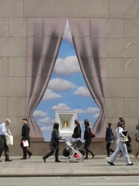
That’s why I find the Tiffany image so interesting. An open curtain, a blue sky, a framed jewel. Little more. And yet everything is there.
There’s a promise. There’s silence. There’s desire. There’s a classic, almost old-fashioned theatricality, but a very powerful one. The piece doesn’t need to invade half the city to work. It doesn’t need to overwhelm the pedestrian. It doesn’t need to flex muscle. It’s a restrained, elegant, almost poetic image.
And today, that starts to look revolutionary.
Because in a context where many brands compete to produce the biggest, most inflatable, most absurd or most photogenic object, restraint becomes a form of intelligence. Not everything has to be a superproduction. Not everything has to be a total experience. Sometimes a well-thought-out window says more than an entire facade covered in foam, plastic and budget.
Real luxury doesn’t always shout. Often it just opens the curtain a little.

Bottega Veneta offers another interesting case, because here the spectacle has something many installations lack: brand code. That intense green, that padded texture, that soft, almost tactile feel, turn the pop-up into a kind of habitable bag.
It’s not just «let’s do something big.» It’s more like: «let’s bring our visual language into the space.»
And that changes a great deal.
Scale doesn’t bother anyone when it answers to an idea. Theatricality isn’t a problem when it’s born from a clear identity. Excess can be useful when it amplifies a recognizable code, not when it tries to paper over a lack of thought.
Bottega isn’t just building a green structure. It’s building recognition. And in retail, recognition is gold. A brand that manages to be recognizable even before the customer reads the name is playing in a different league.
So the question isn’t whether retail should be spectacular or not. That question is too simple. The real question is this:
is the spectacle serving the brand, the product and the customer, or is it only serving the photo?

Moncler, with its giant octopus invading 10 Corso Como, goes straight into surrealist territory. Enormous tentacles, strange color, a sea creature colonizing a fashion space. It’s brilliant, unsettling and a little apocalyptic. Like almost everything that defines our era well.
And let’s admit it: the image has power. A lot of it.
There’s something almost cinematic about seeing fashion behave like an invasion. The store stops being a store and becomes a story. The building is no longer a container, but part of a fiction. The customer doesn’t just walk in to see clothes; they walk into a world.
Done well, that can be extraordinary.
But there’s also a dangerous line. When the installation is remembered more than the brand, something starts to fail. When the customer talks about the octopus but doesn’t remember what product was there, maybe we’ve created a great image and a poor commercial operation. When the experience devours the merchandise, visual merchandising stops selling and starts putting on theater for its own sake.
And to be clear, I have nothing against theater. Quite the opposite. Retail needs theater. But it needs theater with direction, not just big scenery.

What’s interesting about all these actions is that the window display is no longer only in the window. It has left the glass. It’s on the facade, in the street, in the courtyard, in the square, in the airport, in the reel, in the article, in the conversation. The window display is no longer a lit rectangle. It’s an extended system of perception.
Dior uses the facade. Marc Jacobs uses the street. Moncler uses the building. Bottega Veneta uses the pop-up as architecture. Diesel turns a show into a total environment. Axel Arigato turns a temporary installation into landscape. Tiffany, from a different place, keeps the intelligence of the classic window display: a scene, a promise, an object.
This confirms something I consider fundamental at BARRONVISUAL: the physical store can no longer be thought of only as a point of sale. It’s a communication medium. It’s an urban interface. It’s a content platform. It’s a positioning tool. And, when well designed, it’s also a conversion machine.
But that’s exactly why we should demand more from it. Not less.
If a store no longer just sells but communicates, positions, moves people, generates content and creates memory, then it can’t be designed on a whim. It needs a system. It needs judgment. It needs an architecture of intent.
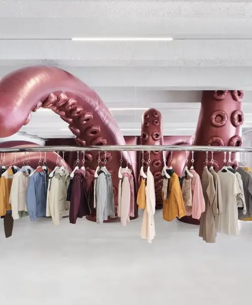
Inside the store, Moncler’s octopus raises an even more concrete question: is the experience serving the product, or is the product serving the experience?
Because those aren’t the same thing.
An installation can elevate a collection, create atmosphere, build tension, multiply desire and make the customer remember a garment more intensely. But it can also do exactly the opposite: steal all the attention, turn the merchandise into a prop, and transform the store into a set where buying seems almost secondary.
And this isn’t a minor detail. It’s the heart of visual merchandising.
Visual merchandising isn’t about putting pretty things on display. It’s about directing the gaze, ordering priorities, creating desire and enabling an action. It can be poetic, yes. It can be spectacular too. But if it doesn’t help the customer understand, feel and act, then it’s decoration. And a very expensive decoration is still decoration.
There’s a phrase that seems clearer to me every day:
experience without hierarchy is expensive noise.

Diesel represents a different kind of energy. Here there’s no silence, no attempt to look zen. There’s graffiti, body, visual mass, excess, impact, noise. It’s retail as a music video on steroids.
And for Diesel that makes sense, because its language doesn’t come from calm. It comes from the street, from the body, from provocation, from a certain visual tension. The problem isn’t excess itself. The problem is excess with no direction.
Even chaos needs composition. Even a loud brand needs hierarchy. Even an aggressive experience needs to know what it wants to provoke, and why.
Because if everything shouts, nothing leads.
And that’s something many brands forget. They believe being memorable means adding more. More color, more volume, more activation, more stimulus, more «wow.» But «wow» has been devalued. Today anyone can make something big, inflatable, shiny, strange or TikTok-worthy. The real difficulty lies in making something that, besides grabbing attention, builds meaning.
Attention isn’t the end. It’s only the door.

Axel Arigato offers a cleaner, colder, more artificial scene: a blue inflatable landscape, a suspended jacket, an almost surgical atmosphere. It’s store, content set, installation and brand experience all at once.
And this defines the current moment very well. The customer no longer visits a store just to buy. They also visit to check whether a brand belongs to the present. To see if it has a world of its own. To see if it deserves to be photographed, shared, remembered. The store has become physical proof of relevance.
But belonging to the present doesn’t mean putting technology or inflatables everywhere. It doesn’t mean adding screens, QR codes, interactive mirrors or inspirational vinyl quotes either.
Phygital isn’t that.
Phygital isn’t putting a QR code next to a product and feeling innovative. Phygital isn’t a touchscreen nobody touches because it’s badly placed or, let’s be honest, just too much effort. Phygital means the physical and the digital work as a single system: the installation generates content, the content generates traffic, the traffic generates data, the data improves the experience, the experience feeds the brand, and the brand converts better.
The right question isn’t: «how do we make people look?»
The right question is: what happens after they look?

The giant flamingo at the airport interests me because it doesn’t quite belong to the same register as fashion brands, but it helps make sense of something important: scale can change how a person perceives a space. An airport is usually a place of transit, waiting, tiredness and a certain dehumanization. An installation like this forces you to lift your head, to look, to step out of autopilot mode for a second.
That’s also experience.
Not everything has to sell directly. Not everything has to convert in the first minute. Sometimes a spatial intervention can simply crack open the routine. And in such a saturated world, that also has value.
But even there, there’s a responsibility. The scale has to make sense. The material has to make sense. The duration has to make sense. The environmental impact has to make sense. Because the planet is also watching, even though it doesn’t have an Instagram account.
And here we arrive at a contradiction retail will have to face with more maturity: many brands talk about sustainability while producing gigantic ephemeral installations for campaigns that last a few days. They talk about consciousness while moving tons of material, logistics, transport, setup and teardown to get one photo. They talk about values while turning the planet into an infinite prop warehouse.
This isn’t about cancelling creativity. That would be absurd and rather sad. It’s about making it smarter. More modular, more reusable, more circular, more honest. More aware that an experience shouldn’t just be a mountain of waste waiting to be badly recycled after being well photographed.
If an installation only exists to be destroyed after generating content, maybe it wasn’t an experience. Maybe it was trash with a marketing budget.
The customer isn’t traffic. They’re a person
In retail we’ve grown used to talking about footfall, dwell time, conversion, engagement, entry rate, journey, interaction, user-generated content. All of that is necessary. I work with that logic myself, because without data there’s no system, and without a system everything stays pretty intuition.
But it’s worth not forgetting the obvious: behind every metric there’s a person.
A tired, saturated, overstimulated person, with less time, less patience and more mental noise than ever. A person who already lives surrounded by screens, notifications, ads, urgencies, microtrends and desires manufactured at industrial speed.
And retail, instead of asking how to better accompany that person, often decides to add another layer of saturation.
How brilliant. There’s a fire, let’s pour on perfume.
A humanist experience doesn’t overwhelm the customer. It guides them. It doesn’t treat them as a captive audience. It recognizes them as someone with a body, time, intelligence and limits. It doesn’t turn them solely into a content generator. It invites them to participate without forcing them to act as an extra in the campaign.
This matters because the customer experience shouldn’t be an elegant form of sensory exploitation. It should be a form of hospitality, of direction, of desire and of respect.


