Visual Merchandising Guide: How to Write One Your Team Actually Uses (With Template)
Juan Carlos Barrón·October 2026·Retail Design
Here is something head offices do not like to hear: most visual merchandising guides are not written for stores. They are written for the meeting where they get presented. Eighty beautiful pages, flawless renders, words like “aspirational”, “impactful” or “elegant”… and on Monday at nine in the morning a store manager two people short, three boxes of unopened stock and a window to install before the shutter goes up. Nobody opens that guide. And the brand wonders why every store looks like a different label.
In more than 25 years between Zara, CHANEL, Galeries Lafayette, Lladró and my own projects I have worked with guides of every size: the ones that turn a campaign into sales and the ones that end up propping a door open. The difference is not budget. It is how they are written. Here is the full method, a template you can copy today and real examples from my archive so you can see how ideas make it onto the glass.
What a visual merchandising guide is (and what it is not)
A visual merchandising guide is a set of instructions so that a campaign, a collection or a store standard is executed equally well in every point of sale, whoever installs it. It is not the brand book, which deals with logos and typefaces. Nor is it just a planogram, which says which product goes on which shelf. The guide connects both with what actually happens in the store: the window, the entrance, tables, walls, the till, props, dates and who does what.
And no, it is not just for chains. If you have a single store but change staff every season, open on Sundays with temporary staff or hand the window to someone who is not you, you need a guide. Even if it is six pages long.
CHANEL: a visual merchandising guide page with one question, a short answer and a reference image (the Printemps boutique, Paris). Every block should be this direct. Archive of Juan Carlos Barrón.
Why most guides end up in a drawer
Ask any store for the campaign guide and you will hear the same answers: “it’s in the email”, “the manager has it”, “we printed it but it doesn’t make sense”. Behind them there are almost always the same five mistakes.
It is written in adjectives. “Create a warm, sophisticated atmosphere” cannot be installed. “Three mannequins, the central one 20 cm further forward, camel coat open, 3,000 K light” can. It has no priorities. If the window, the entrance table and the back wall weigh the same, the store sets up whatever is easiest, not whatever sells most. It uses renders instead of photos. Staff do not recognise themselves in a catalogue-perfect store; they recognise their own fixture, floor and light. It is identical for every store. A guide designed for 300 m² applied to 60 m² produces a crammed window and a store you cannot walk through. Nobody checks anything. Without a photo back or a checklist, the guide is a suggestion.
Does it matter that much? According to iwd, a visual merchandising software company, one of its clients measured that its well-merchandised stores turned over around 30% more than those that were not, and that stores not following the latest guidelines lagged about 15 points behind. It is a vendor figure from a single network, so treat it as a pointer. But anyone who has compared two stores in the same chain knows the gap is real.
Eight differences between the guide that gets filed and the one that gets used. Same budget, opposite result. Infographic: BARRONVISUAL.
Anatomy of a visual merchandising guide that gets used: eight blocks
After seeing hundreds of guides, this is the structure that works for a neighbourhood shop and for a network of a hundred stores. Eight blocks. Miss one and the store improvises. Add too much text and nobody opens it.
The eight blocks of a visual merchandising guide your team applies. Infographic: BARRONVISUAL.
1. The campaign in one line and the hero product
Page one: what we are saying, to whom and why now, in one line. Underneath, the hero product with its reference, price and the units the store should hold. If whoever installs does not know what they have to sell, they will install whatever looks pretty.
2. Dates, owners and the photo back
Date and time for install, refresh and strike. Name of who installs, who signs off and who gets the photo. It sounds like bureaucracy. It is what stops the sale window still being up in the second week of February.
3. Priorities by zone: the plan rules
A store plan with three numbered hot zones: usually the window, the first table and the back wall, which pulls customers inside. They are installed in that order. If at 9:55 there was only time for two, make them one and two. Lladró solved it with “zoning”: every area of the store a circle and a number, with the recommended pieces for each.
Lladró, VM Newsletter: a store “zoned” into eight numbered areas. A plan like this sets priorities better than three pages of text. Archive of Juan Carlos Barrón.Lladró on the street: the guide brought to the glass, with the same zone and height logic in every window. Photo: Juan Carlos Barrón.
4. A dimensioned window: measurements, not adjectives
The window is explained like an architectural drawing: dimensioned elevation, position of each mannequin, product heights, graphics and vinyls with their measurements, light temperature. Agent Provocateur’s sheet for its Christmas launch does it perfectly: drawing of the window, the concept in two words, props list and focus boutiques. Plus a warning in capitals every guide should copy: this is not your store drawing, find yours at the end of the document.
Agent Provocateur, “Mistletoe Neon” window sheet: concept, props and focus boutiques on a single page. Archive of Juan Carlos Barrón.
5. Tables, walls and planograms in photos
One reference photo per fixture, taken in a real store or in a mockshop, a full-scale store mock-up where the campaign is tested before it is sent out. Next to it, the don’t: the overloaded table, the wall with no colour story, the missing size. A well-chosen photo teaches more than three paragraphs, and staff recognise themselves in it.
Mockshop and planogram: the store is built first as a mock-up, and the guide’s reference photos come from there. Archive of Juan Carlos Barrón.
6. Materials and props, step by step
A list of parts with quantities, how they arrive packed, how they are assembled and what to do if something arrives broken. Like flat-pack furniture instructions, but done well: detail photos, hanging points, cable type, who restocks. Every minute staff spend deciphering a part is a minute not serving customers.
Step three of the same campaign: how to assemble and hang the illuminated mistletoe, with detail photos. This is what makes a hundred stores install the same way. Archive of Juan Carlos Barrón.
7. S, M and L versions
What always stays (the hero product, the colour, the message) and what goes when the store is small: one mannequin fewer, one table instead of two, the wall reduced to a single bay. Without this page, the small store tries to squeeze in the big store’s campaign and ends up as a storeroom with lights.
8. Checklist and sign-off photo
Ten points checked at the end and one photo from the same angle as the reference. It is the cheapest quality-control tool there is and the most often forgotten. The Inside Shops maintenance sheet below fits on one page: exterior, atmosphere, till, lighting, staff, fitting rooms, stockroom, cleanliness and security, scored 0 to 3 every month. Nothing more is needed.
Inside Shops: visual image maintenance list and merchandising checklist, scored 0 to 3 per item and month. One sheet, no excuses. Archive of Juan Carlos Barrón.
Template: the visual merchandising guide in 20 pages
Copy it as it is and adapt it to your store. For a single small store, keep pages 1, 2, 3, 4, 6, 9 and 20.
The life cycle of a guide: from head office to the till
A guide is not written and sent. It is tested, installed, photographed, measured and fixed. The cycle I propose starts eight weeks before the campaign with a commercial brief (product, goal and KPI), goes through the mock-up, the reference photo and a ten-minute call per zone with each manager, and does not end at install: it ends two weeks later, when you look at sales by zone and ask the team what they did not understand. That answer is the first line of the next guide.
The full cycle, from W-8 to W+2. What fails in store gets fixed in the next guide. Infographic: BARRONVISUAL.
Here is how it works in a real case. The “Curiosity” back-to-school proposal for National Geographic, autumn-winter 2014 collection, started as a board with an aquarium background and the brand’s yellow frame. In store it became a suspended orca, children’s mannequins and the line “The future belongs to the curious”. The guide was the bridge: same idea, same proportions, the same yellow frame in every window.
National Geographic, “Curiosity Sharks” back-to-school proposal: the idea on a single board. Archive of Juan Carlos Barrón.The same concept on the glass, with people stopping in front of it. From board to street without losing the idea: that is what a guide is for. Photo: Juan Carlos Barrón.
“My store is small, this is for chains”
It is the objection I hear most in training. And it is a trap. The small store is exactly the one that needs a guide most, because it depends on very few people: if the person who knows how to dress the window goes on holiday, the store is left without judgement. A six-page guide (campaign, dates, plan, window, table and checklist) can be written in an afternoon and saves you the improvised August window, the entrance table without a hero product and the “I didn’t know it had to be changed”.
Writing it also forces you to decide. What you sell first, where and why. Many small stores do not have a visual merchandising problem: they have a problem of decisions not taken, and the guide exposes it.
Self-criticism: visual merchandisers write to impress the boss
Now the mirror. Those of us in this profession are largely to blame for guides nobody uses. We show off with the render, the cover, the trend vocabulary, because that is what gets applause in the presentation. And we leave for last the measurements page, the broken-prop page and the 60 m² store page, which are the ones that actually save Monday. A guide is not judged in the meeting room. It is judged in the photo back.
My rule: if a page of the guide does not change what someone does with their hands in the store, cut it.
Your next step
If you want to learn to write guides like this, with templates and examples from major brands, there is the VM Guidelines & Retail Campaigns course (€69). If you would rather we build it with your team, in your store, that is the In-Company Workshop. And if you do not know where to start, book a 20-minute Diagnosis with me.
One question for you: when was the last time someone on your team opened the campaign guide? Tell me in the comments.
Frequently asked questions
What should a visual merchandising guide include?
Eight blocks: the campaign in one line with the hero product, dates and owners, zone priorities, a dimensioned window, reference photos of tables and walls, materials and props, versions by store size, and a checklist with a sign-off photo.
How many pages should it have?
Between 16 and 24 for a chain, and around six for an independent store. Length matters less than making sure every page changes what someone does in store.
What is the difference between a visual merchandising guide and a planogram?
A planogram shows which product goes on each shelf or fixture. The guide includes the planogram, but also the window, priorities, props, dates and compliance checks.
How do I know if my stores are applying the guide?
Ask for a photo from the same angle as the reference and a ten-point checklist when the install is finished. Then compare sales by zone before and after the campaign.
How often should it be updated?
The core principles once a year. Campaign sheets at every window change. And whenever the team tells you a page does not make sense.
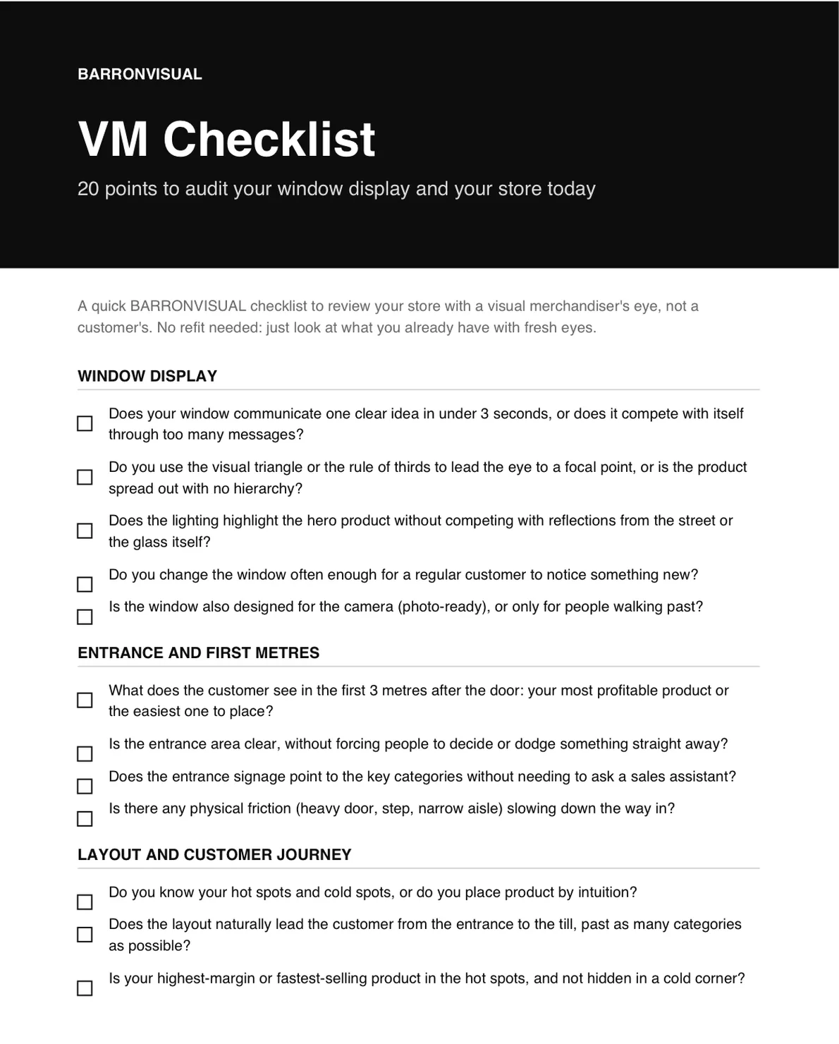
VM Checklist: 20 points to audit your storefront and your store today.
A short PDF to review your store with a visual merchandiser's eye, not a customer's. No renovation needed, just look at what you already have with fresh eyes.
I send you the PDF and, over the following days, 4 short emails to apply it. Unsubscribe in one click.