The 8 economic concepts every Visual Merchandiser should master
You don’t need to be an economist to do this job well. But every visual decision (where to place a product, how much stock to display, how large a focal point should be) has a direct economic consequence. These are the eight concepts that mark the difference between decorating a store and designing it with judgment:
1. Elasticity of demand. Measures how a product’s demand changes when its price or visibility changes. A highly elastic product reacts strongly to a change in exposure; an inelastic one barely moves, no matter who buys it. Understanding this helps decide which product deserves the most expensive focal point in the window: not always the most profitable one, but the one that reacts most to being well displayed.
2. ROI (return on investment). How much is earned for every euro invested in a Visual Merchandising intervention: a window redesign, a layout change, new signage. Without this figure, any VM budget is defended with adjectives («it looks more premium») instead of verifiable results.
3. Opportunity cost. Every square metre, every focal point and every week of window display dedicated to one product is space not dedicated to another. Opportunity cost forces the question of what is given up by choosing A over B, something rarely calculated explicitly in Visual Merchandising and that should always be worked out before building a window display.
4. Conversion rate. Of everyone who walks into the store, how many buy. It’s the most quoted KPI in the industry and, even so, the most misused: high conversion with little traffic can be a worse outcome than lower conversion with heavy traffic. It should always be read alongside the traffic figure, never alone.
5. Average ticket. How much each buying customer spends on average. Visual Merchandising has a direct influence here: cross-selling at the till, fully styling a mannequin (instead of a single loose garment), or good «pairs with» signage all raise the average ticket without needing more traffic.
6. Margin. Not everything that sells generates the same profit. Placing the fastest-moving product in the most visible spot, instead of the one with the highest margin, is a common mistake that only shows up when sales data is cross-checked with margin per reference.
7. Stock turnover. The speed at which available stock is sold. A garment that has spent eight weeks in the same hot spot without moving isn’t a matter of patience: it’s a signal that the display isn’t working, and it’s time to change its position, its scale, or the window itself.
8. Sales per square metre. How much revenue is generated per square metre of store. This is the KPI that lets you truly compare different zones, stores, or even different chains, beyond gross sales figures.
These eight concepts are the foundation. A good Visual Merchandiser doesn’t just make the product look good. They make the product make sense for the customer and for the business. That’s where the real difference lies between decorating a store and doing Visual Merchandising.
The customer journey KPIs: what happens between the door and the till
The eight concepts above explain the economic result. But to act on the window display, the layout or the focal points, another layer of data is needed: the one that describes, step by step, how a customer moves through the store. This is where Visual Merchandising connects with customer journey analytics, a discipline that in 2026 is used systematically by 73% of the best-performing retailers, according to industry data compiled by Shopify.
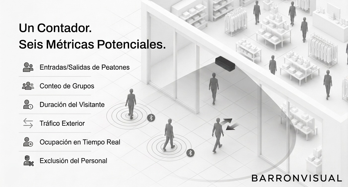
Footfall. The number of people who walk past the window display. It’s the first piece of data, the one that gives context to everything else: without knowing how many people pass by, no other figure, neither entries nor sales, can be interpreted correctly.
Capture rate. The percentage of that foot traffic that actually enters the store. It’s calculated by cross-referencing the entrance counter with the exterior traffic counter, and it is, literally, the window display’s KPI: it measures whether those three seconds we always talk about at BARRONVISUAL manage to convert someone walking by into someone walking in.
Stopping power. The percentage of people who interrupt their walk to stop and look at a window display or a specific focal point. It measures whether the visual storytelling is strong enough to break the «autopilot» we walk through the street or a shopping centre with.
Dwell time. How long a customer stays in front of a zone or a display. A healthy average dwell time is around 15-20 minutes per visit in fashion stores, though it varies a lot by sector. Dwell time correlates with engagement and, in many product categories, with conversion: more time usually means more genuine purchase intent.
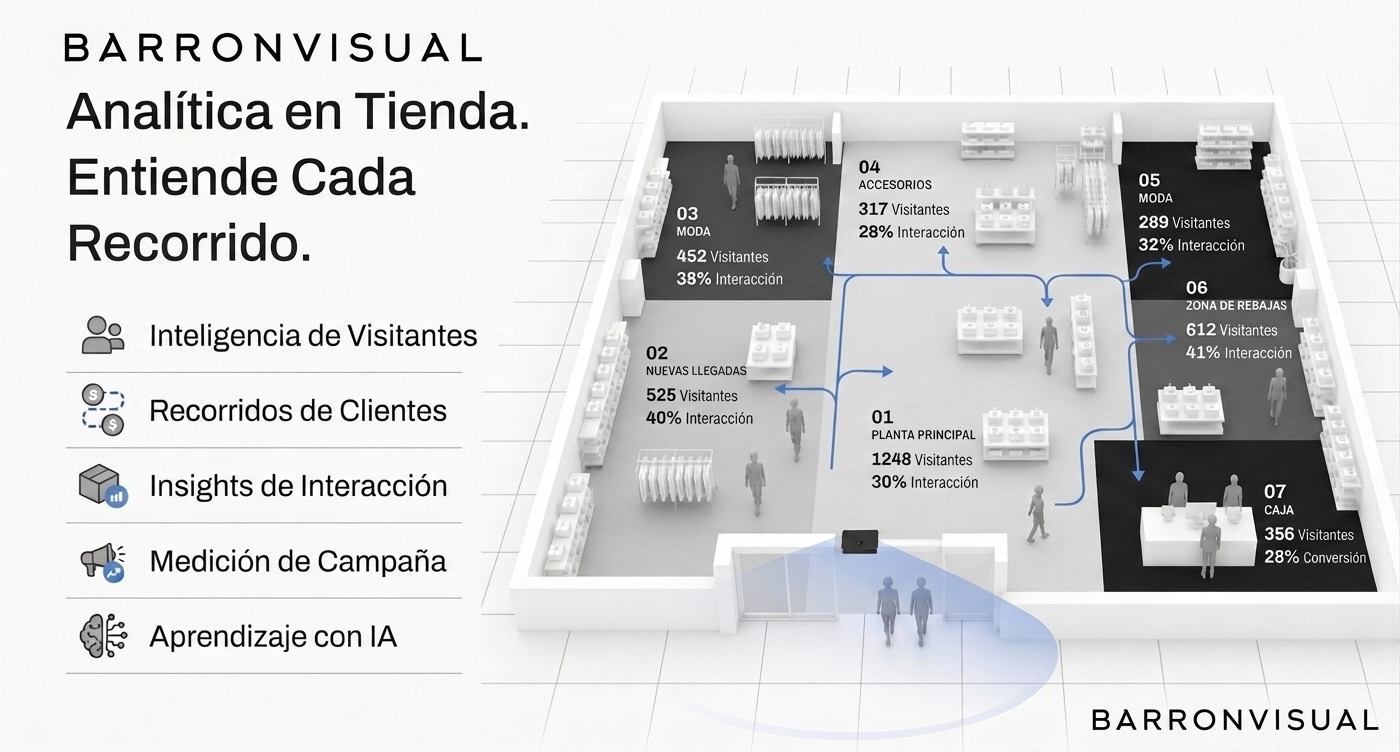
Heat mapping and hot and cold zones. Heat mapping technology records where the customer actually moves inside the store and overlays that information on the floor plan. The result is hot zones (high traffic, ideal for margin products or new arrivals) and cold zones (low traffic, which need visual reinforcement, lighting, or a layout change to avoid losing sales). Without this data, deciding where to place each product category is, literally, guesswork.

Productivity KPIs: how much each metre and each reference yields
Beyond the economic concepts and the customer journey, there is a third group of indicators that very specifically measures the performance of the space and the product on display:
Sales per square metre. The most granular version of productivity per square metre: how much revenue, in euros, each square metre of store generates per year. A common benchmark in fashion retail runs between 300 and 400 dollars per square foot annually (roughly €3,200-4,300/m² per year), although the exact figure varies enormously by sector, location and product’s average ticket.
GMROI (Gross Margin Return On Inventory). Measures how much gross margin each euro invested in stock generates: GMROI = Gross margin ÷ Average inventory cost. A GMROI above 1 means the inventory generates more profit than it costs to hold; below 1, that stock is losing money simply by sitting there, taking up space and capital without returning it.
Sell-through rate. The percentage of received units that have actually been sold in a period: Sell-through = (Units sold ÷ Units received) × 100. A rate approaching 100% warns of stockout risk; a rate below 50% signals overbuying or a display that isn’t working, and that’s exactly where Visual Merchandising can (and should) step in before it’s time to discount and clear.
Units Per Transaction (UPT) and cross-selling. How many units a customer buys on average per visit. A fully styled mannequin, a complementary-product table, or good «pairs with» signage are direct Visual Merchandising levers for moving this number, exactly like the last-minute display next to the till has always done in physical stores.

The technology that’s changing how this is measured in 2026
Until a few years ago, this data was collected by hand: an employee with a clicker counter at the door, a stopwatch and a lot of patience. That has changed completely. The global computer vision software market for retail is valued at 5.4 billion dollars in 2026, and chains like Sephora and Nike already use AI-powered video analytics to measure in real time how customers interact with each display, optimising product placement and store flow.
A widely cited case in the industry is Kroger, which analysed dwell times by section, redesigned the highest-friction points of its customer journey, and achieved a 12% increase in conversion rate from that change alone, without touching either the assortment or the price.
The technology that makes this possible is based, in most cases, on 3D stereo vision: discreet sensors, usually installed on the ceiling above entrances or in specific zones, that generate a depth map and detect each person’s silhouette through deep learning, with no need for facial recognition cameras or collecting any personally identifiable data. The system assigns an anonymous path to each visitor and uses it to build the heat map, dwell time by zone and capture rate automatically and continuously, 24 hours a day.
This is, at its core, the same logic we always apply at BARRONVISUAL when talking about phygital retail: every element of a physical store has its digital equivalent. Heat mapping in a physical store is exactly the same thing as a website’s click heat map; a window display’s capture rate is the same concept as a banner’s CTR; dwell time in-store is the same data as time on page in an eCommerce site. Whoever measures one channel well and not the other is only seeing half of their customer’s real journey.

Common mistakes when measuring Visual Merchandising
It isn’t just a matter of having more data. These are the most common failures, even in teams that already measure:
- Looking at conversion without traffic. A 40% conversion rate with 20 visits a day says much less than it seems to.
- Confusing correlation with causation. Sales going up the same week as a window change doesn’t prove the window is the cause: you have to isolate the variable, comparing against equivalent periods or stores.
- Measuring only once. A KPI without a time series is useless for deciding anything. What matters is the trend, not the snapshot.
- Not cross-referencing KPIs. Dwell time without conversion, or margin without turnover, only tell half the story.
- Measuring only the physical store or only the website. In a phygital business, the KPI that actually matters is the one for the whole journey, not each channel separately.
BONUS TRACK (for making it this far):
SAVE THIS INFOGRAPHIC!
Save it, print it, stick it near your till and use it:

From data to decisions: how these KPIs are actually used
Having these numbers is worthless if they don’t turn into design decisions. A real, data-based workflow usually follows this order:
- Start with the diagnosis: current traffic, capture rate, heat map and sales per m², to know exactly where the problem is (is it the window display, the interior layout, the product on display, or the price?).
- Cross that data with margin and turnover per reference, to decide which product deserves the most expensive focal point: not always the prettiest one, but the one that best combines turnover, margin and elasticity.
- Act on the space (window display, layout, signage, lighting) with a specific, measurable change, never a generic redesign done «because it’s due for a refresh».
- Measure again with the same KPIs, over a comparable period, to verify whether the intervention genuinely moved the number it was meant to move.
This is precisely the approach we follow at BARRONVISUAL in every phygital retail audit: we don’t hand over a generic list of aesthetic recommendations, but a real KPI diagnosis and an action plan prioritised by economic impact.
If you want to master these KPIs with a full syllabus (footfall, GMROI, predictive AI and store digital twins included), we have a dedicated course: Retail Performance Intensive.
Visual Merchandising that isn’t measured is, at best, a lucky bet.