Visual Merchandising 2.0: How to Bring the Store’s Magic to eCommerce.
Juan Carlos Barrón·September 2026·Virtual Merchandising
Hi community! 👋
After a bit of a break, I’m picking this blog back up to talk about something I’m passionate about: blending the art of the physical window display with the digital environment, known in the eCommerce world as Online Visual Merchandising. 🚀
1) Why pick this back up now?
As a visual merchandiser with over 10 years in physical retail and experience in omnichannel environments, I’ve noticed that many brands still haven’t carried the magic of the window display and the store into the online world. That’s the space where the consumer «walks in» virtually, browses, decides, and buys. As the Intelistyle article puts it, «just like in-store visual merchandising, online visual merchandising means using visual elements to enhance the overall shopping experience for customers.»
Web visual merchandising
2) What does applying visual merchandising to a website actually mean?
In a physical store, we work on window displays, layout, customer journeys, atmosphere…
Online, the «window display» is the homepage, the navigation, the banners, the way products are arranged, the personalized recommendations.
Good online VM doesn’t just display products: it guides, seduces, inspires and converts.
Here’s a summary of strategies I’ve applied myself, which line up with what Intelistyle lays out:
Treat your homepage like a window display: it’s the first impression. Strong images, dynamic banners, featured products.
Design a web layout with the customer in mind: just like in a store you study traffic and «hot spots,» online it’s structured so the user finds what’s relevant fast.
Make navigation fluid and logical: clear categories, filters, visual search if possible. In a physical store we use signage; the online equivalents are filters, suggestions, visual search.
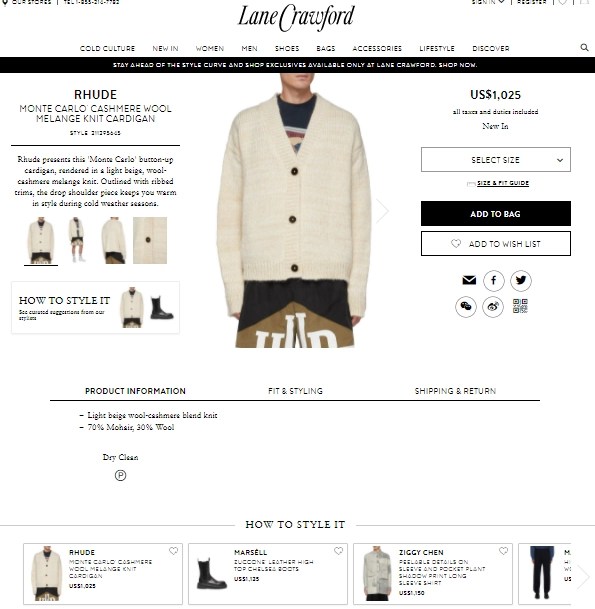
Optimize product pages as if they were individual window displays: quality photos, different angles, lifestyle shots, context… as if the customer could «touch» the product.
Bundle products: similar to a mannequin or display suggesting a full outfit in-store, online you can show «pairs well with…», «shop this look».
Make the most of the «checkout mindset»: the payment step is a key moment to suggest additional products, just like we place «add-ons» next to the register in a store.
Urban Outfitters homepage, using editorial fashion and home cards as a digital window display
4) Why does this make sense in 2025?
Consumers increasingly move between physical and digital, and expect the same quality of experience in both channels.
A strong online presence can amplify in-store sales, and vice versa.
As a visual merchandiser, you have the advantage of combining creativity, space, product and data to generate greater impact.
5) A real example: when online checkout copies the physical counter
A case I often use to explain this in consulting: any fashion eCommerce site showing «customers who bought this also bought…» right next to the pay button is doing exactly the same thing as a sales assistant who places a belt next to the register while ringing up a pair of trousers. It’s impulse merchandising, only the «assistant» is a recommendation algorithm. The difference isn’t in the principle (it’s always been the same: capitalize on the moment of highest purchase intent), but in the tool that executes it.
The same goes for a well-built product page: several photos, a short video, the garment worn and in context, aren’t «more content» just for the sake of it. They’re the digital version of taking the garment off the rack, looking at it from both sides, and trying it on in front of the mirror. If the eCommerce site doesn’t reproduce that physical gesture with visual resources, it’s selling blind.
6) My commitment to you
From here I want to share more articles, case studies, best practices and reflections on how to apply physical visual merchandising to the online environment: visual + digital = a coherent experience.
I invite you to comment: are you already applying online VM in your team? What challenges do you run into? Let’s open the dialogue.
If you want to go deeper into this with a full curriculum, we have two courses that develop exactly this topic: Visual Merchandising 2.0 (digital visual hierarchy, generative-AI fitting rooms and social commerce) and Omnichannel Visual Merchandising (physical-digital coherence, RFID and store digital twins).
Thanks for stopping by again. I’m delighted to pick the blog back up and connect with you!
💬 Leave me a comment or send me a message if you’re interested in developing this topic together.
—
Juan Carlos Barron Garcia
Visual Merchandiser & Omnichannel Strategist
Free resource
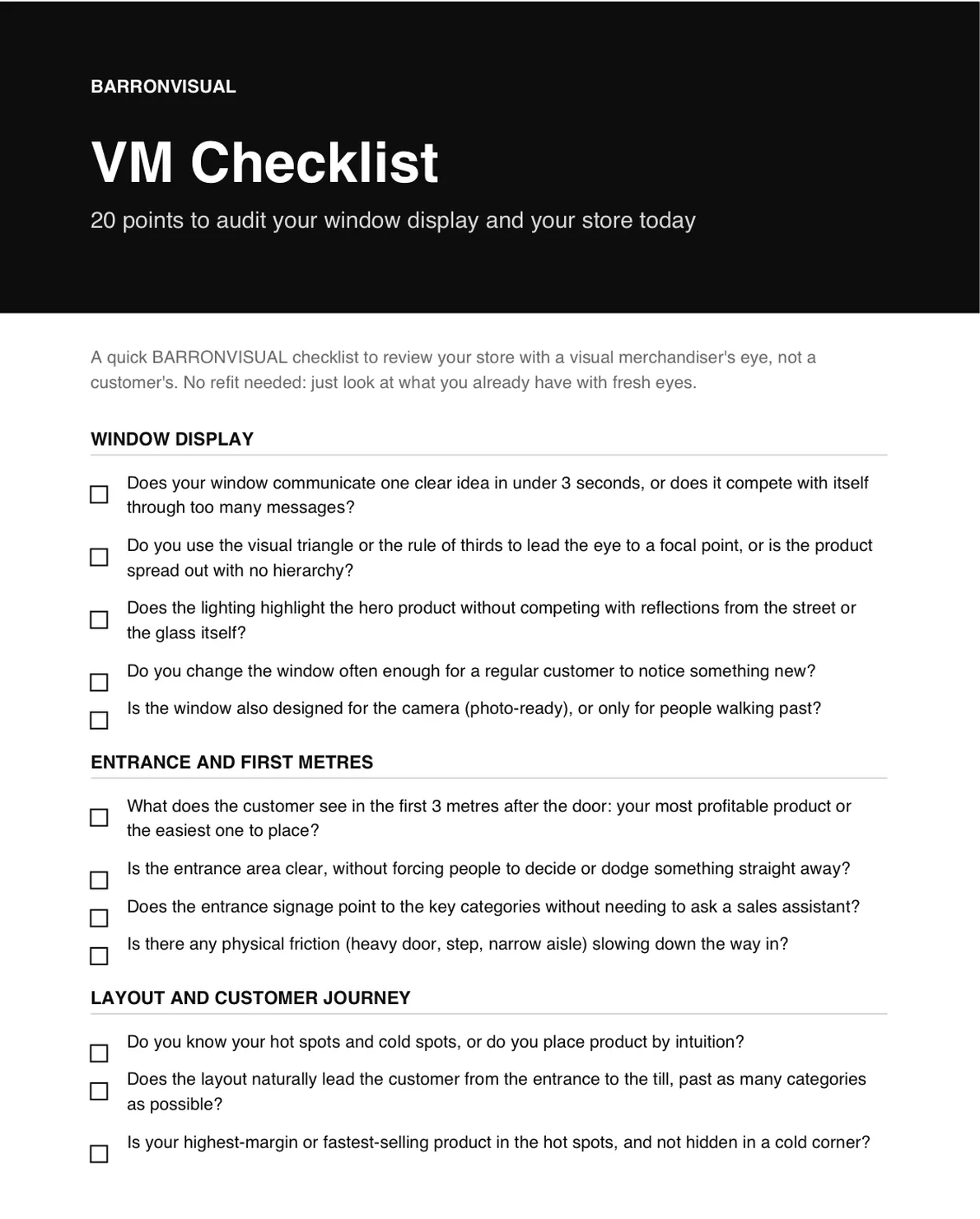
VM Checklist: 20 points to audit your storefront and your store today.
A short PDF to review your store with a visual merchandiser's eye, not a customer's. No renovation needed, just look at what you already have with fresh eyes.
I send you the PDF and, over the following days, 4 short emails to apply it. Unsubscribe in one click.