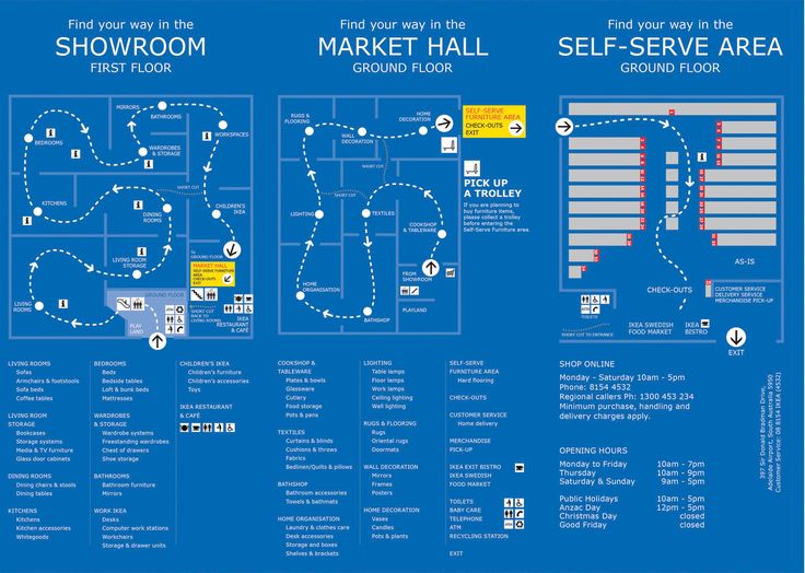
Cold zones: where the customer has to be deliberately led
Cold zones are the opposite: corners, the back of the store, spots the customer’s natural path doesn’t visit unless something pushes them there. The strategy that works isn’t «decorating» the cold zone better, it’s placing necessity-driven product there, the kind the customer actively looks for even if they have to walk to find it, and using it as a magnet to pull traffic into that part of the store. It’s the same logic supermarkets use when they put milk or bread all the way at the back: it isn’t chance, it’s deliberate journey design.


How to spot your own hot and cold zones
You don’t need sensor technology to get started. A simple exercise: over one week, mark on a store floor plan where customers actually walk (not where you think they walk) and which zones consistently sit empty of people. Compare that map with where your highest-margin product currently lives. If the product you most want to sell is sitting in a cold zone on that map, you already know why it isn’t moving.

The most common mistake: designing the layout once and never touching it again
Hot and cold zones aren’t fixed forever. They shift with the season, with a renovation next door that changes street flow, even with where a one-off promotion is placed. A layout designed once, years ago, and never revisited, is just as problematic as a window display that hasn’t changed in months: it stops responding to how today’s real customer actually behaves. Layout should be reviewed with the same calendar discipline we apply to window displays in our post on local retail: a fixed schedule for periodic review, not a one-off decision frozen in time.

Layout, not decoration
The underlying confusion, the one that trips up so many stores here, is treating layout as an aesthetic matter. It’s a matter of behavioural data applied to interior architecture: what path the customer follows, what they see first, what they see last, and which product benefits from being at each point of that journey. At the Studio we design layout as a complete system, not a furniture arrangement, and in the Phygital Retail Audit we identify exactly which zones of your store are being wasted right now.
People say we’re the best at store layout at BARRONVISUAL. There’s probably some truth to it. It’s true that plenty of architects consult us before handing over a retail project.